How I Create a Composite Image
I love taking multiple images and seeing how I can edit them together to create a whole new image! People often ask me ‘how in the world did you do that?’ To answer that question in detail takes a long time. It also has a lot of, ‘I’m not really sure’ or ‘I don’t know how to describe it’ answers. I thought I would try and showcase how I created one of my latest composite images. I feel like I start off strong and explain it pretty well. Then, unfortunately, towards the end of the step-by-step, I lose focus on how I really did it, and can’t really figure out how to totally explain it all. Questions?….probably huh? Well, here is my best description on, how I did that:
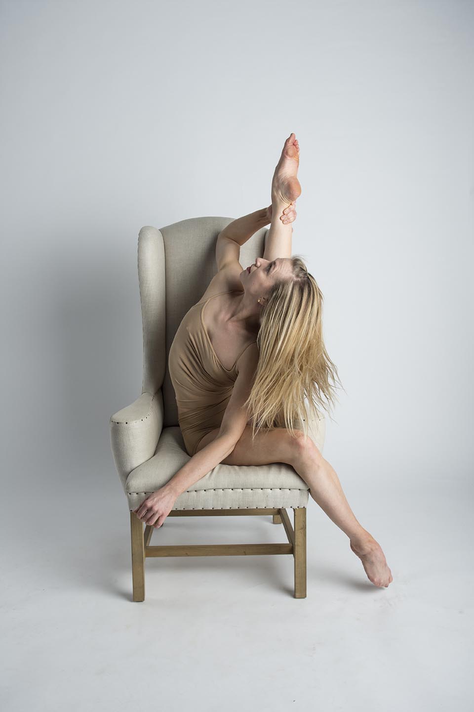

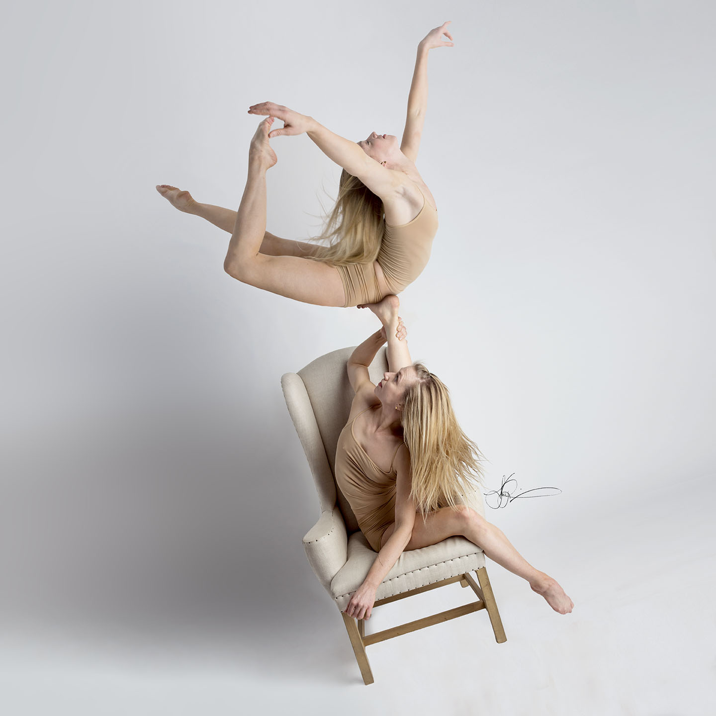
I started with an image of one person and ended up with an image of two people. I have no idea how I came up with the idea. I just wanted the image of the woman in the chair to ‘be more’ than what it was. It wasn’t interesting enough. So, how do I make it ‘more’? That was the question I asked myself when I started.
Step One: Decide on Canvas Size
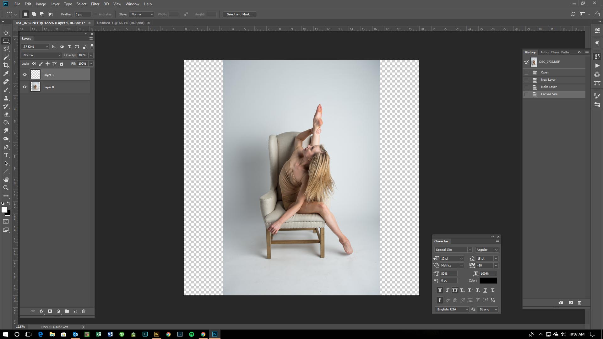
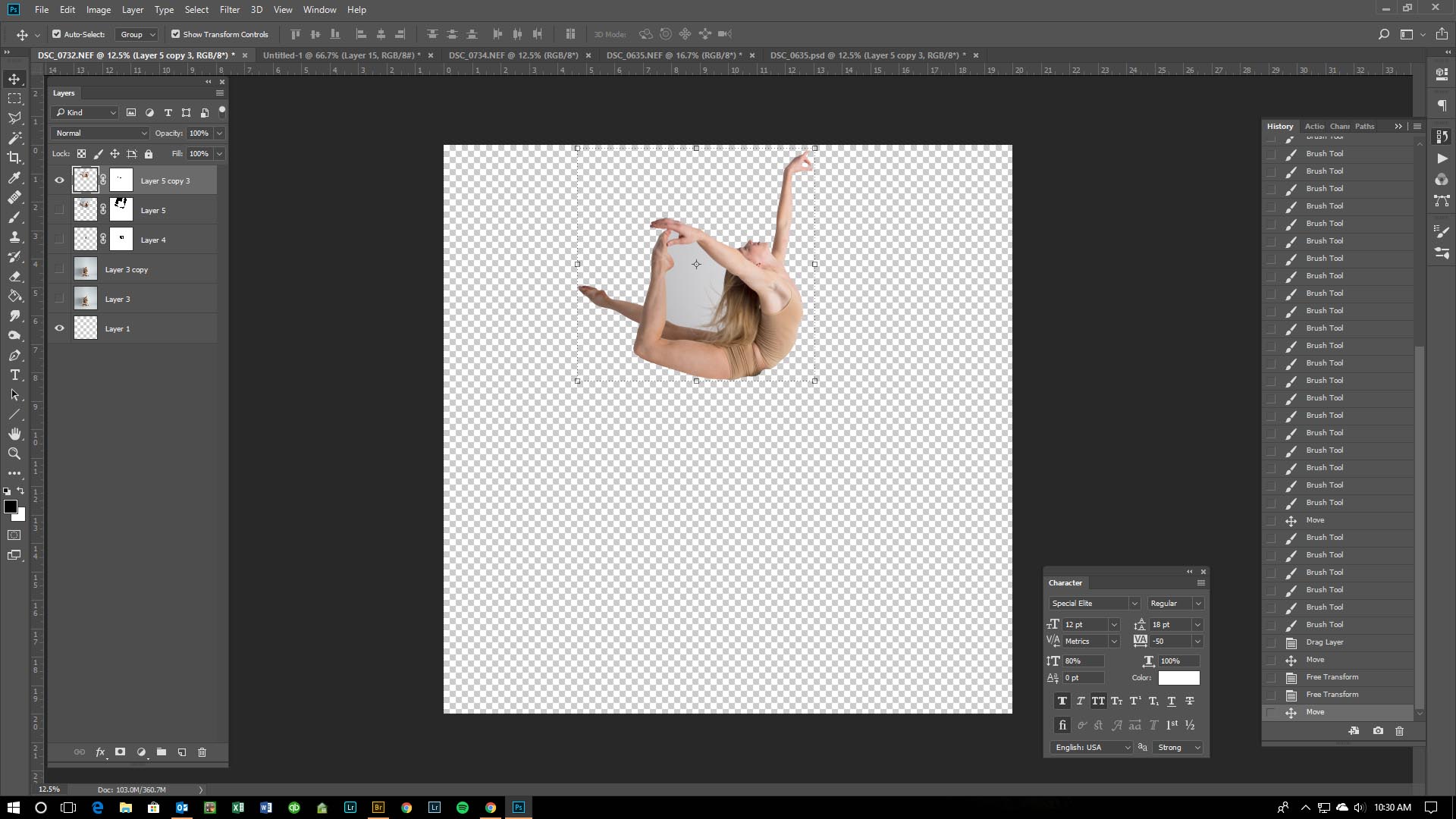
I love my images to be square. No idea why. I start out in Photoshop by adding in a blank layer to my project, dropping that layer to the bottom, then change my canvas size to 20×20
Step Two: Creating the Background
I know that I have more imagery that I am adding to this project. So, I will shrink down the current layer to leave room for what I will be adding. (or I can make the canvas size bigger from step 1)
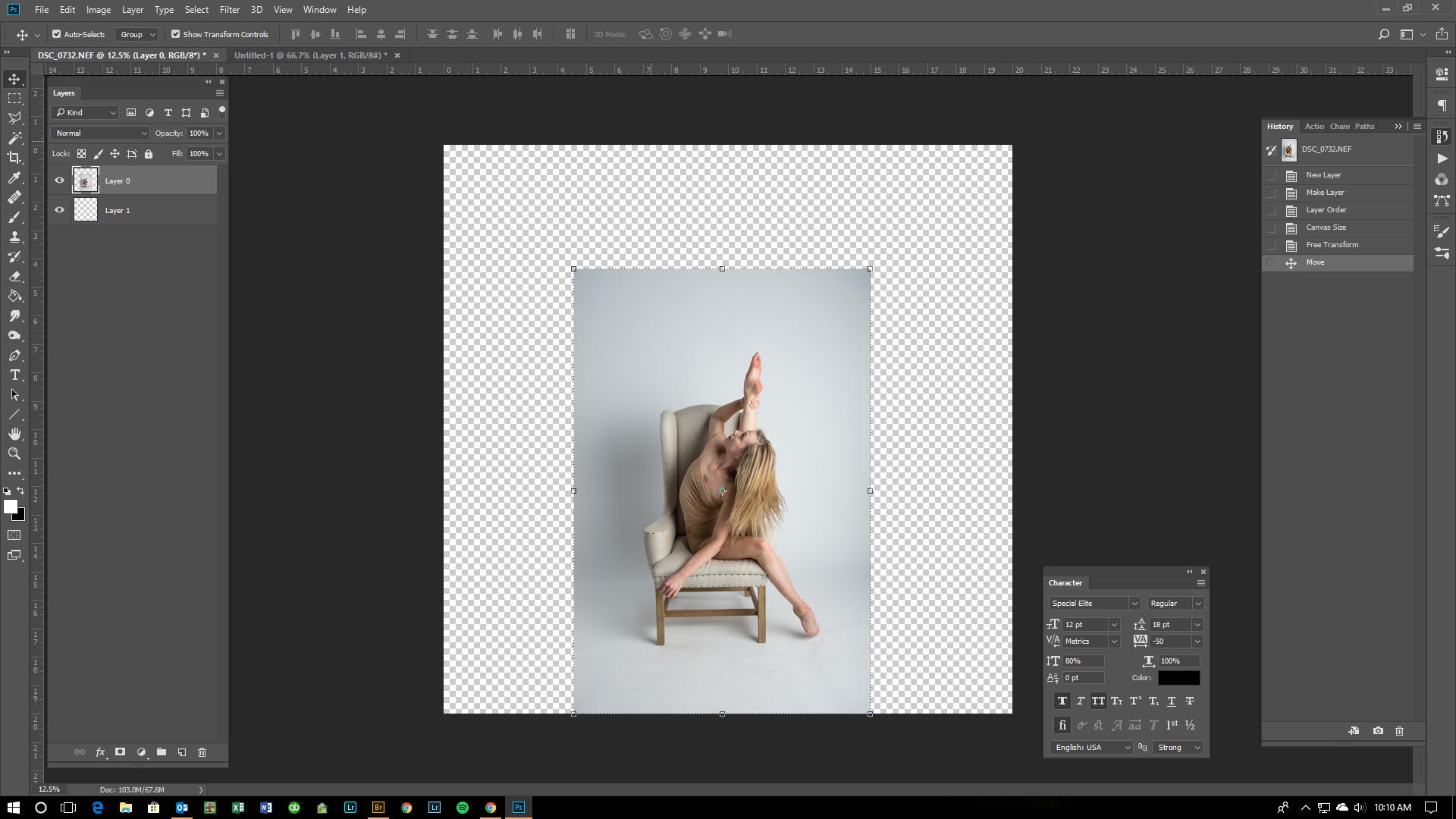
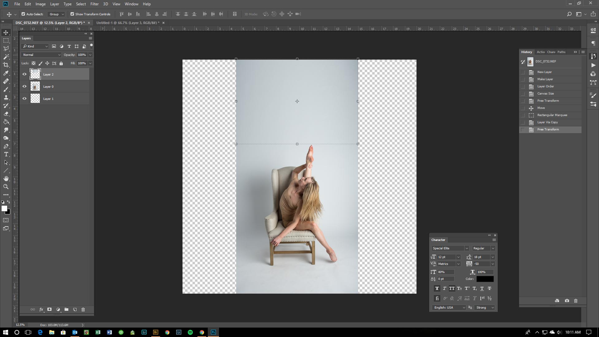
In order to fill the background with the correct texture and color, I use the current image and extend portions of the backdrop. I select (use the select tool) the top section right before her foot so I don’t grab any of her skin. Then I copy (control J) that portion I selected. This creates a new layer with that selection.

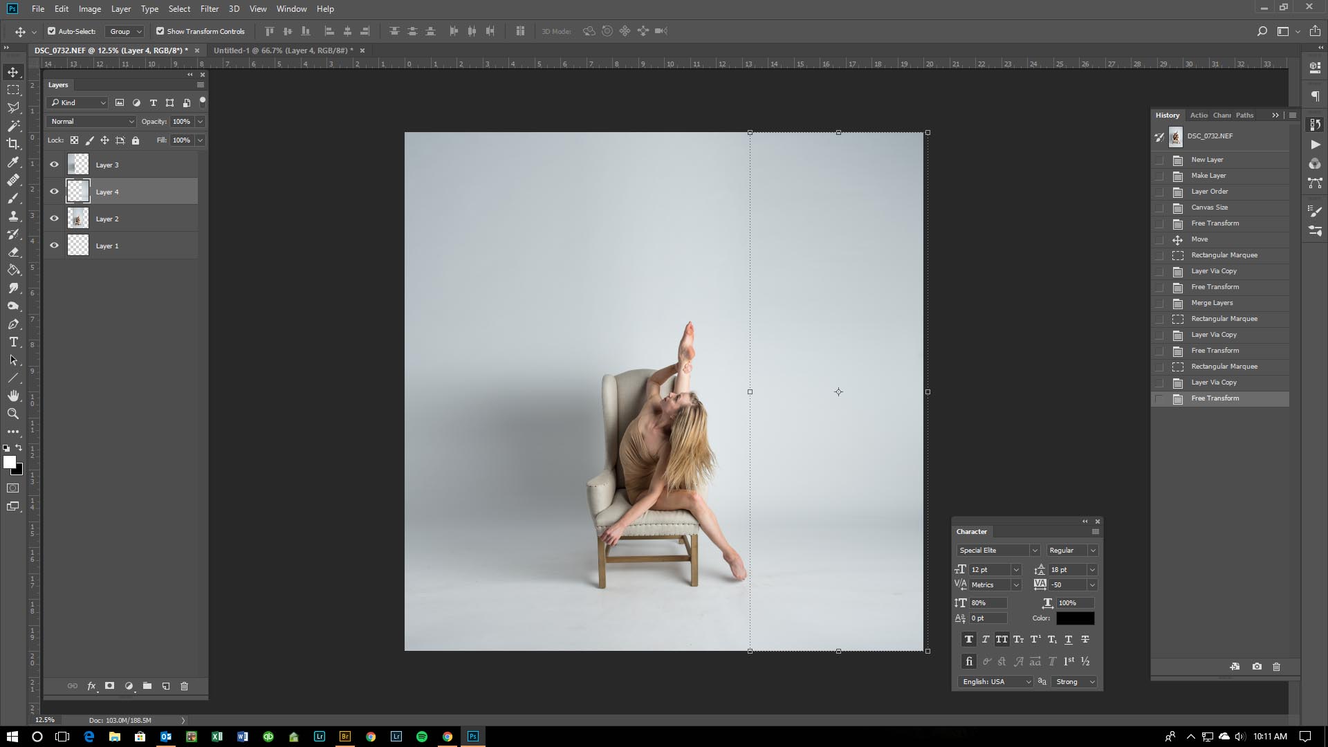
This new layer now needs to be transformed to fit the background. Using the selection tool, I grab the top of the new image and drag it to the top of my canvas. After I’ve got it the size I want, hit enter to confirm the transform, then merge that layer, with the original image. (leave the blank layer alone)
I repeat this process for the remaining sides so I have a full background on my image.
Step Three: Adding in Additional Pieces
There are a lot of factors to think about when deciding what images will work for this layout I have in mind. Shadows, where the light is coming from, how her foot can’t hold anyone right now because it’s pointed, which direction is her hair falling…. I try and make sure whatever I am doing to the image, that in the end, it will look seamless. There’s nothing more annoying than seeing an amazing composite idea put together and having the light source be completely off in part of the layout.
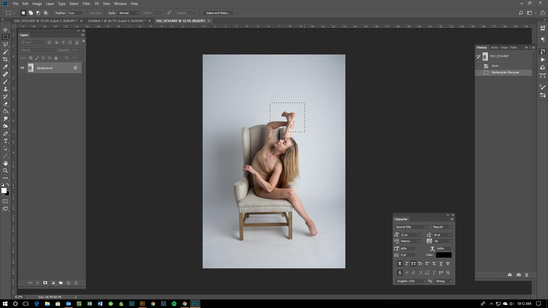
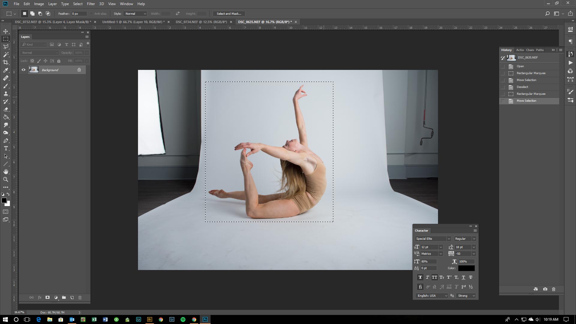
Going through all the images I have from this shoot, I’ve found two that I will need to create this piece. One is the woman on top. The second is the flattened foot of the woman in the chair (because she can’t hold the other woman with just her toe)
I open up these two images, select the areas of the photo I need while making sure I have enough extra space around the selection, and drag them into my main piece.
Step Four: Placing Additional Imagery
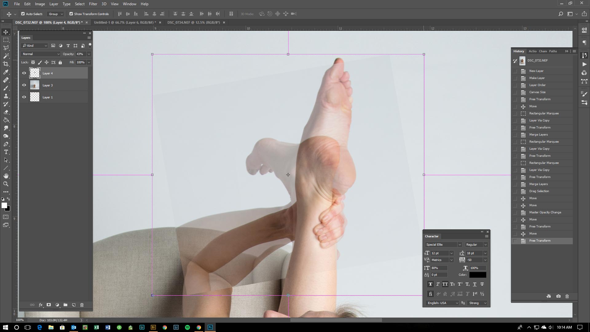
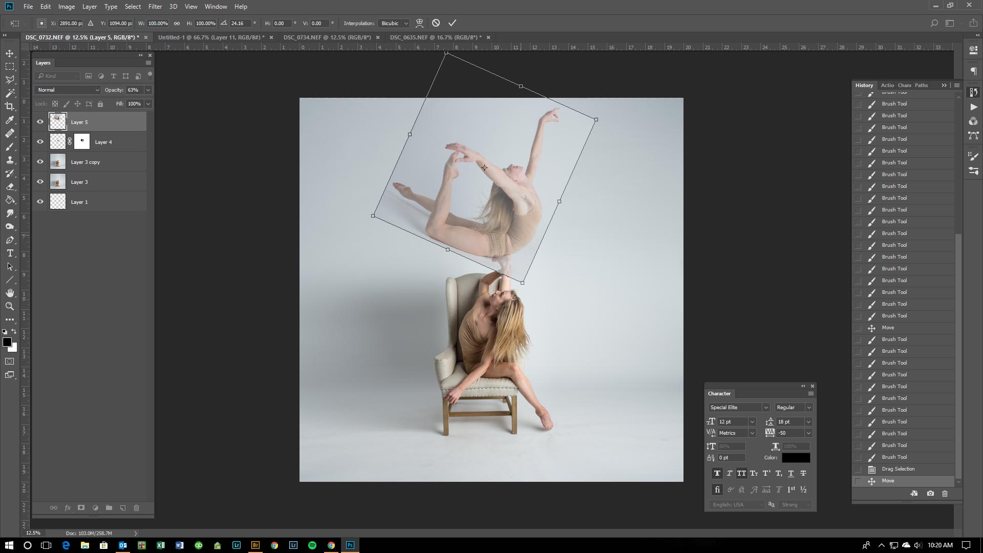
After I have the pieces I need, I begin fitting them into place. The easiest way for me is to drop down the opacity (upper right slider in layers window) to about 50%. This way I can see both the image I want to replace and the image I’m replacing that section with. I highlight the layer I want to use as the replacement and using the Move tool I hold down the Shift key and transform that layer to the correct size, angle, and location.
Step Five: Making the Additional Pieces Cohesive
Here’s where things get harder for me to explain. Also, this is the step that takes me hours and hours to get the way I want it to look.
Once the piece is in the right spot, there are three things I have to do. First, duplicate my main image. I do this in case I totally screw up somewhere and have to start over. Second, erase the original part of the image so it doesn’t hang over into the new piece. I use the Stamp tool for this.
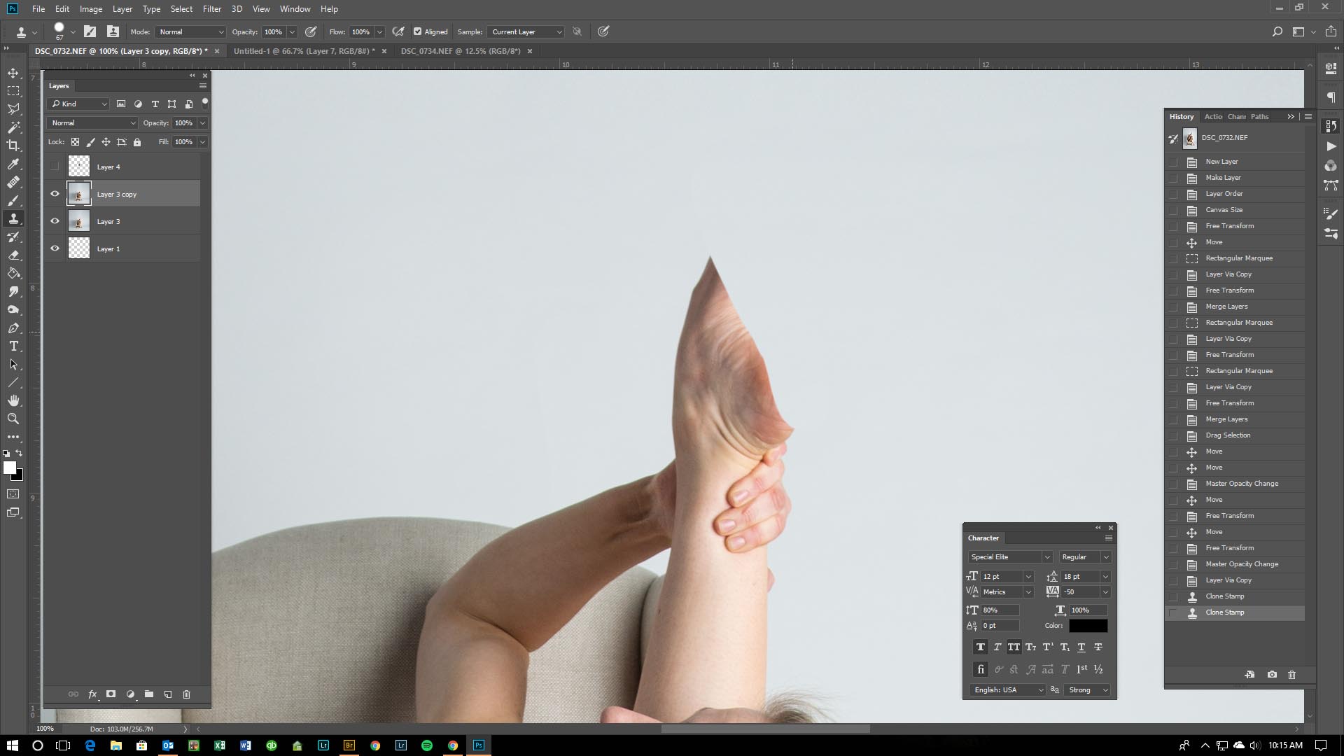
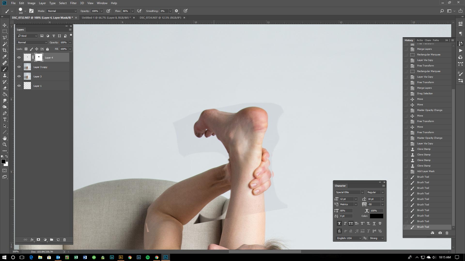
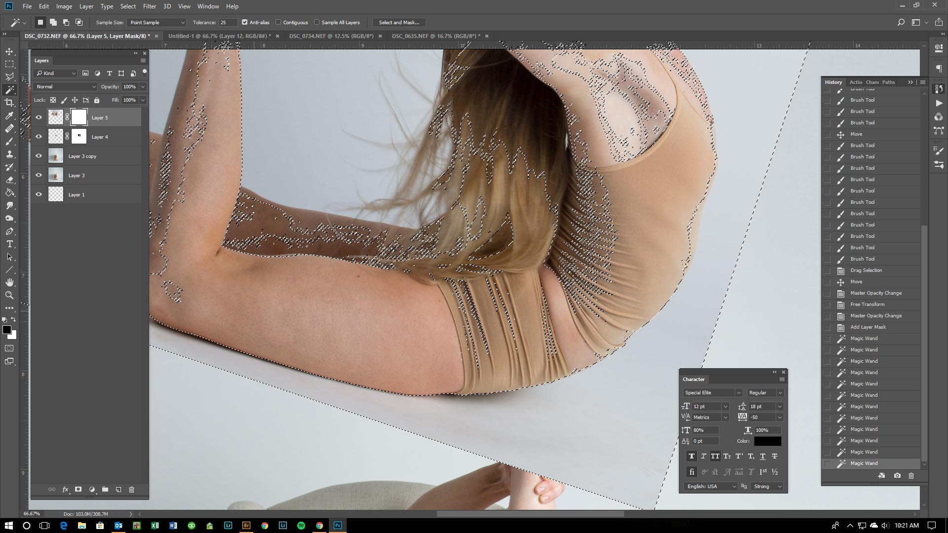
Third, on the new layer, I create a Layer Mask and start to paint out what I don’t want from that part. It’s a long process of matching tones, lines, shadows and more so that you can’t tell one image wasn’t there, to begin with.
Having a Layer Mask is a great way to erase parts of an image without actually erasing the image. There is so much you can do with them. I learned this technique while just tinkering around in Photoshop. So, I’m not the greatest at explaining it.
You can select certain areas to help you ‘paint’ in or out sections of your Layer Mask. This will help you get closer to the areas that are hard to paint free hand.
Liquify is another way to manipulate your image so the parts seamlessly fit together. Highlight the layer you want to use, go to Filter, then Liquify.
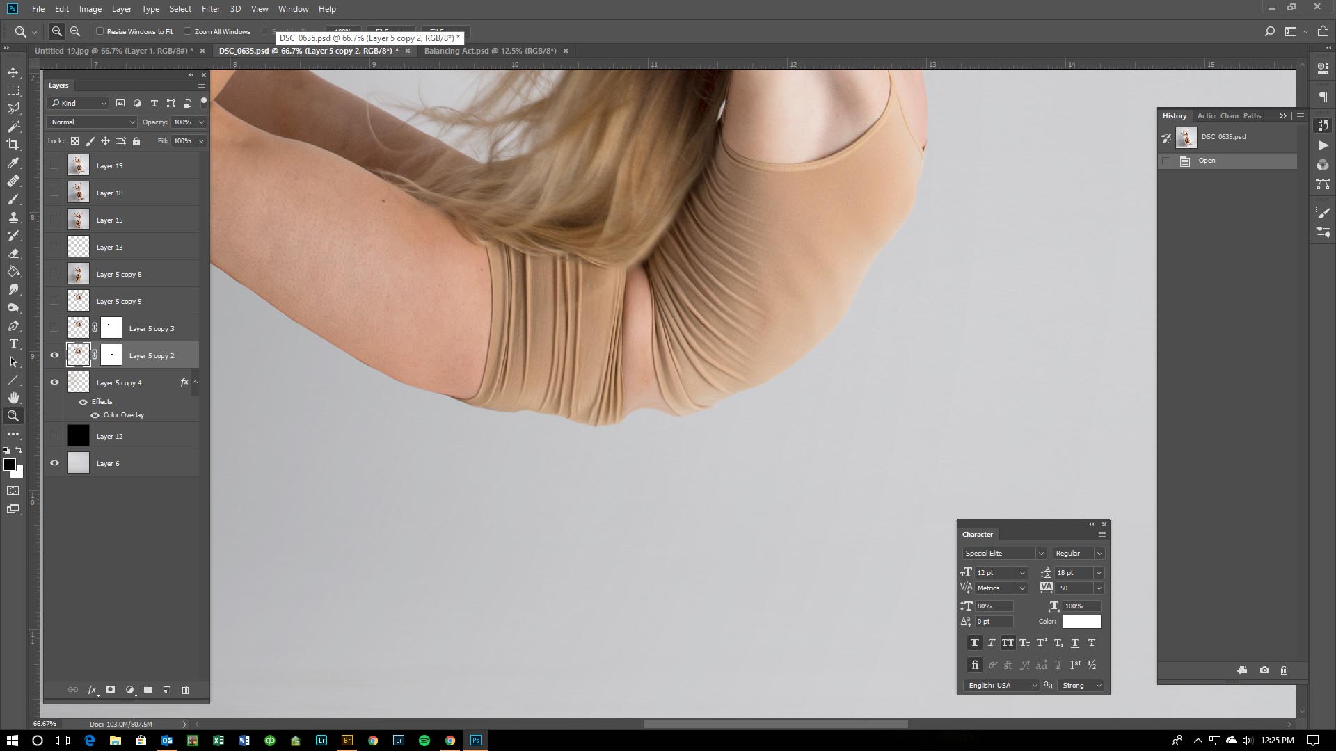
Step Six: Shadows and Light
Bringing in new bits and pieces means having to add in the bits and pieces that were never there to begin with. Things like the shadow on top of the foot for the woman in the chair. She wasn’t balancing anyone before, so there was never a shadow to showcase that. Again, I often duplicate the image I’m going to mess with in case I totally screw up. When creating shadows I do a combination of using the Levels sliders and the Burn and Dodge tool. Sometimes when altering the piece I have to also manipulate the color balance. Am I getting vaguer on this explanation? Just wait…it gets worse.
Step Seven: The Tilt
Ok. Here’s where things get more fun. I really liked where the image was going at this point, but it was missing something. In comes the tilt. I duplicated all layers, then merged them into one. Then, duplicated that layer. Because again, I tend to mess up and like to start from an easy beginning point when I do. From there, I used my Move tool to rotate the image to it’s tipped position.
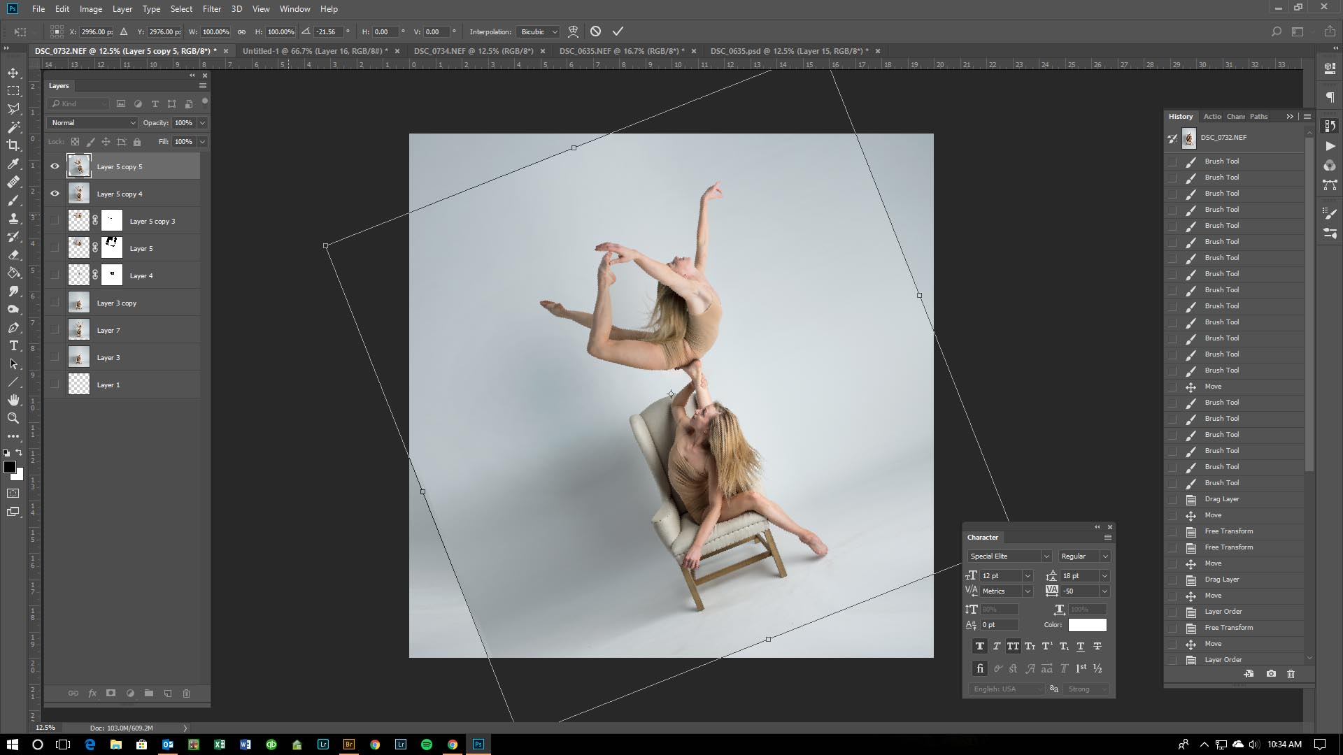
Step Eight: Back to the Shadows and Background
Now that the image is tilted the way I like it, I have to make it believable. To do this, shadows must again be manipulated. I’d like to tell you how I did this. I truly do! All I know is that it took me many days, selecting of the background, duplicating things, blurring areas, erasing areas, and so much more that I lost track…sorry. But whatever I did, it worked and I’m happy. #Imnotagreatteacher
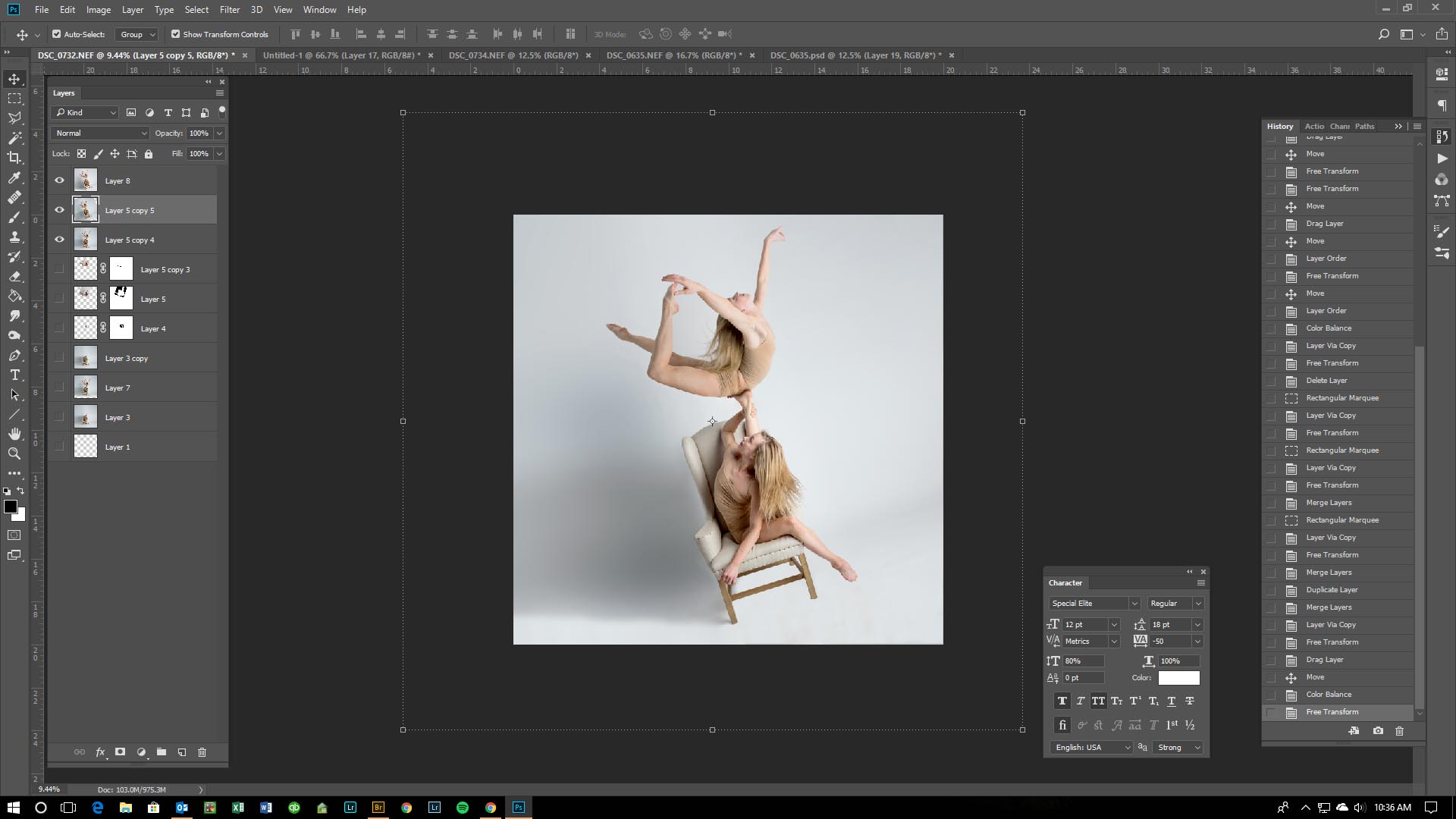
Finished Piece
